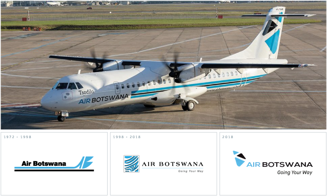
Air Botswana recently purchased two brand new ATR 72-600 aircraft and upon seeing pictures of the aircraft, I couldn’t help but notice a new logo on the side of the planes. It was later reported that Air Botswana had rebranded to mark the airline’s 30th anniversary… they kept that very quiet!
A rebrand for an organisation such as Air Botswana is very interesting, as it’s a brand people have a love/hate relationship with. Being a parastatal, people have long been calling for the airline to be privatised because Air Botswana is notorious for delays, infrequent flights and extremely high ticket prices. A national airline should induce a sense of national pride, but regrettably; emotions are normally frustration, anger and embarrassment. There was a time when Air Botswana had scheduled flights to Johannesburg, Cape Town, Harare and Windhoek, but the airline’s decline has seen all international destinations, except Johannesburg, phased out. Three decades of Air Botswana and you’re left wondering how it has survived this long, let alone afforded new planes… or a rebrand for that matter.
[At the time of this post being written, there are reports that suggest Air Botswana will be reintroducing flights to Cape Town.]
A rebrand is not a decision any organisation should take lightly; it’s a huge undertaking that implies people should expect change. Rebranding can breathe new life into a business or product, but there needs to be a strategy and it has to be done for the right reasons. This is why Air Botswana’s rebrand is intriguing since most of the reasons large organisations rebrand do not really apply to Air Botswana. They have no competition, so they don’t need to reposition themselves in a market they fully monopolise. If anything, they need to redefine and reinforce their brand, but not necessarily reinvent it. Therefore I have my concerns, so here are my five questions about Air Botswana’s rebrand.
The quotes below were taken from an article in the ‘Wings of Service’ magazine with regards to the rebrand.
1. Why celebrate diamonds?
“…the design is inspired by Botswana’s diamonds, represented by the three shapes that make up the ‘tail’ of the logo…”
This rebrand marks the 30th anniversary of Botswana’s only airline; 30 years of serving the people and visitors of Botswana. Yet the new icon emphasises a commodity from another industry unrelated to aviation. Of course, diamonds are iconic as they heavily contribute to the country’s economy and they are a crucial factor in Botswana’s growth. But the ease with which the diamond is integrated and celebrated across other business sectors shows disregard to the other industries, which are far from insignificant. Lest we forget, Botswana also mines other valuable minerals (coal, copper) and there are other economic contributors such as farming and beef.
Tourism is arguably what Botswana is best known for and even the Brand Botswana logo emits a sense of warmth, vibrancy and positivity by incorporating the sun. Air Botswana and tourism go hand-in-hand, so the permanent feature of diamonds seems very odd. I’m not sure a diamond is the most appropriate element to incorporate into the rebrand. Yes, from a design perspective, the diamond shape is a good shape to manipulate and construct something visually aesthetic. I’m not suggesting the logo should have featured a farmer or sorghum or a cow, but I do feel using the diamond is very much ‘inside the box’ thinking.
Also, the symbolic meaning behind the diamond shape is not a natural association with Air Botswana. Words such as ‘purity, innocence, love, fidelity, ethics, faithfulness, truth and trust’. The diamond also represents finery and has a luxurious, high-end appeal, which is actually one of Air Botswana’s biggest failings. The whole experience screams budget airline, but the cost of flying is too high-end.
The brand identity needed to be humble, honest and vibrant, which leads me to my next question.
2. Was there an alternative to diamonds?
The rebrand was prompted by a celebration of the past 30 years, but a rebrand essentially represents the future. Admittedly, Botswana wouldn’t be where it is today without diamonds, but going forward, Botswana wants to be less reliant on diamonds (possibly less focus on diamonds). Minister Kenewendo has commented on the fact she wants prospective investors to understand Botswana is “people-centred” and since Air Botswana is a parastatal that serves the people, surely a governmental vision must be aligned. 
A great example of an airline that rebranded with people in mind is Hawaiian Airlines – click here to view the case study.
The last paragraph of the article states:
“The new logo honours the airline’s heritage, while capturing the timeless spirit of modern Botswana.”
There are literally dozens of alternatives to the all-to-obvious-and-safe-option that is diamonds – any number of the land animals and birds, the Okavango Delta, the bushmen, the exotic plants. A strong contender for me would be to take inspiration from the Botswana basket design. The brand needs an element that resonates and connects with the people, an iconic concept to be proud of.
Basket designs are amazing and have a complexity that represents a high level of skills and competence. Such complex designs could also represent the diversity within the country, the people and cultures. The basket truly signifies the country’s heritage and modern Botswana, while also promoting a local commodity/craft. Air Botswana could have had custom made baskets to serve their snacks, and even sold baskets onboard flights. Plus the product is 100% a Botswana product. There are no foreign influences, they are made in Botswana by Batswana, the skill was developed in Botswana and the materials used are natural resources found in Botswana.

If the continuation of the zebra print wasn’t an option, then an equally flexible, artistic and visually pleasing alternative could have been the basket design. But then again, what was wrong with the zebra print?
3. Why do away with the zebra print?
They say ‘if it isn’t broken, don’t fix it’, so what was wrong with the zebra print concept? Why has it not been integrated within the new design? The zebra is the national animal of Botswana and evokes national pride. The zebra print element was easily recognisable, quite unique in the sense it’s an element unused by any other African nation within their national airline branding (that I’m aware of). Air Botswana’s brand stood out because of this noticeable feature. Isn’t that the objective of a brand… to stand out… be different?
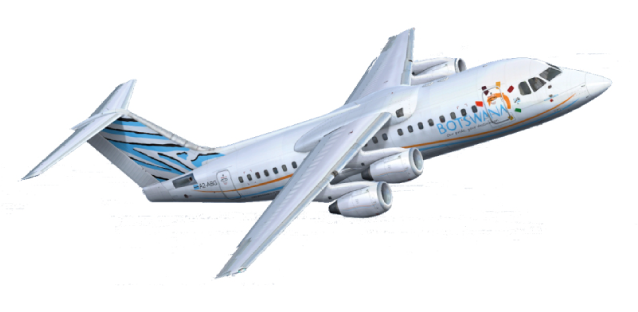
In my opinion, the zebra print was the Air Botswana brand and it was a flexible feature, as it beautifully decorated Air Botswana’s fleet of planes. In essence, the zebra print gave the Air Botswana brand character and relevance in the fact it’s the national symbol. So why remove the brand’s personality? Part of the challenge for any brand is brand awareness and in my opinion, the zebra print was Air Botswana’s strongest brand component. Due to its significance, I doubt this integral feature would have been removed had Air Botswana been privatised.
4. Why place visual significance on southern Africa?
“…the three shapes are grouped to suggest the shape of southern Africa.”
If the shape’s formation represents southern Africa, then why does the larger triangular shape at the bottom place more significance on the most southern area, which is South Africa? If I’m interpreting the hidden meaning correctly… I can see the central shape is black, as too is the word ’Botswana’, so the black shape signifies the country. Therefore the light blue colour represents ‘air’, so that must mean there are plans to reinstate international flights across the southern African region. But sometimes the obvious isn’t always a bad thing if it’s professionally and creatively executed. It would make more sense to form the shapes into the map of Botswana. The airline is called Air Botswana, not Air Southern Africa. Why place visual significance (albeit abstract) on half of the African continent?
Maybe I am nitpicking, but I would hope the ultimate goal for the next 30 years includes plans to extend flights to destinations across the globe, not just southern Africa. In hindsight, this graphic element is potentially restricting and could very well become obsolete in the years to come. I feel a brand of this nature should be personalised to the country it’s from, there’s a reason pretty much every other airline in the world does exactly that.
5. Why is there no consistency?
“Looked at closely, the complete logo evokes an aircraft in flight with an upward trajectory, with the three diamonds on the tail and the name boldly running the length of the fuselage.”
I’m not an aviation expert, but something that is described as having an “upward trajectory” would surely be pointing upwards, but the logo is horizontal?? In any case, there is a disproportionate element I don’t like and that is the scale of the tagline. It’s so large it’s competing with the company name for dominance. Personally, I would have reduced the font size, spaced out the lettering and scaled to the width of the letters ‘SWANA’ or even ‘WANA’, as this would have balanced out the logo better.
I’m even more baffled by the supporting branding collateral and usage. A quick visit to Air Botswana’s social media pages will show you the issue with the logo’s length. If the rebrand was carried out by an experienced, professional designer or agency, surely he/she/they would have created variations of the logo for its different usages? Particularly when you consider the dimensions of social media profile pictures do not lend themselves to long horizontal logos. These are public social media pages, accessible by anyone and everyone and they are currently live with these rookie errors. This isn’t an ideal way to present your new brand and does not showcase competence.
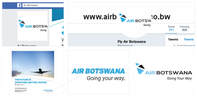
Consistency is also key, so I’m not sure why the logo used on their marketing collateral is a completely different logo. Whatever the reason for this, it needs to be rectified ASAP. Even the typeface used to write the names of the new planes, ‘Tsodilo’ and ‘Okavango’ is a typeface that doesn’t feature on the new logo. Establishing a new brand is difficult, but these silly mistakes are making the challenge much harder than it needs to be. As I say, consistency is key and so far there is little consistency and a lot of confusion.
I hate to say it, but based on this evidence the rebrand simply doesn’t inspire faith in the airline’s capacity to understand the importance of the rebrand. Taking into account there are still flight delays and cancellations, it seems nothing has changed so far and therefore a rebrand celebrating 30 years failed within 30 days.
Some of the reasons rebrands fail are because the organisation doesn’t actually change; a new logo won’t improve your business operations or rebuild trust. A new brand mark signifies change and therefore change has to occur. Other times the rebrand just isn’t necessary and I don’t believe Air Botswana needed a complete overhaul of their brand. The existing brand simply needed a makeover to bring it into the 21st century, just a few modifications to modernise the brand, while retaining its integrity. Below are examples of other airlines who did just that.
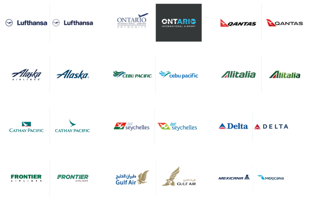
One solution to Air Botswana’s problems has been staring them in the face for years, an option they seem reluctant to consider. They need more bums on seats and those bums need to be on those seats a lot more frequently. This can only be achieved by making flights more affordable to the wider population. Air Botswana needs to introspect, realise the inconvenient truths and deficiencies, while reorganising its internal affairs. This course of action (over the next 30 years) would be far more beneficial to themselves, their investors and their customers than a new image.
The wrong time for a rebrand is when you still have unresolved issues. A rebrand won’t make those issues go away, they will simply taint the new look and you can’t measure the success of the new brand. A rebrand without actual and genuine change is just papering over the cracks.


Absolutely spot on! This rebrand has been bugging me and now I understand why, you’ve hit the nail on the head. Why did they get rid of the zebra print?! I’d love you read more on what you think about many of rebrands in Botswana. Let’s be honest, most are not good.
Your thoughts on branding are really notable, I am going to drive a number of my followers your way.
Whatever you write about hits a nerve with me, many thanks for challenging the difficult for your followers.
That is the very first time I frequented your website and I am amazed with the analysis you made here. It’s incredible. Excellent job!
You are a very bright individual!
I like what you guys are up to. Such clever work and this post does make you think differently about branding! Keep up the excellent works guys I have incorporated you guys to my blogroll. I think it’ll improve the value of my website.